Introduction
In this tutorial, we shall be using Pandas to create visualisations and finally, observe how team performance varies across a season based on ‘Expected Goals’ by viewing past trends from the previous seasons.
We will be using the following:
fbref for Premier League Data
Pandas to create DataFrames
Matplotlib and Seaborn for creating visualisations
Here’s the Github Link with a repository consisting of all the codes used in this tutorial.
Importing Our Data
The first thing we need to do is visit fbref.com and navigate to the Premier League 23/24 stats page.
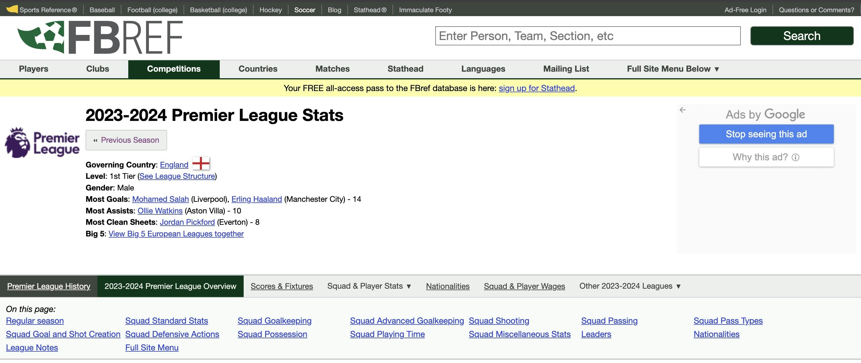
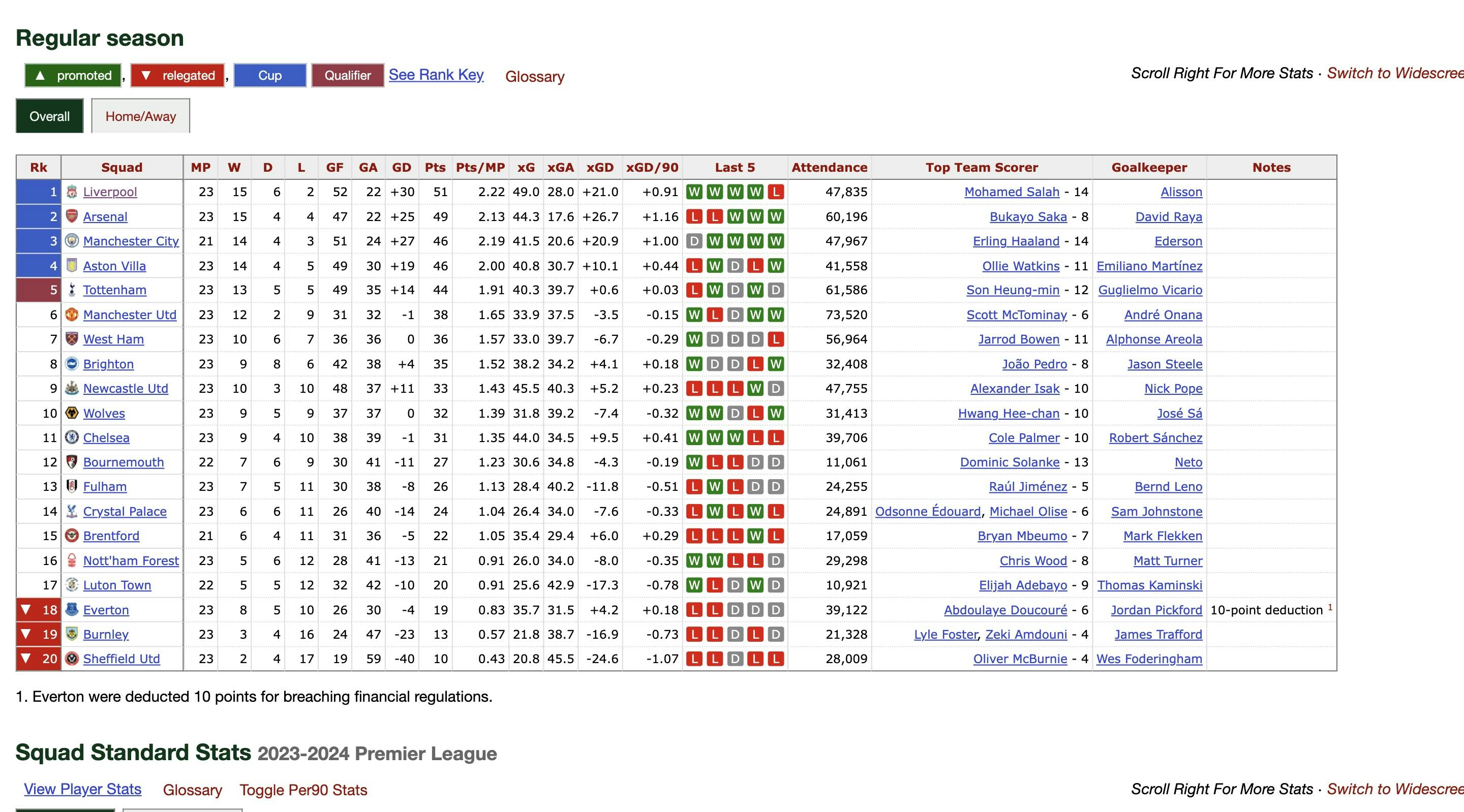
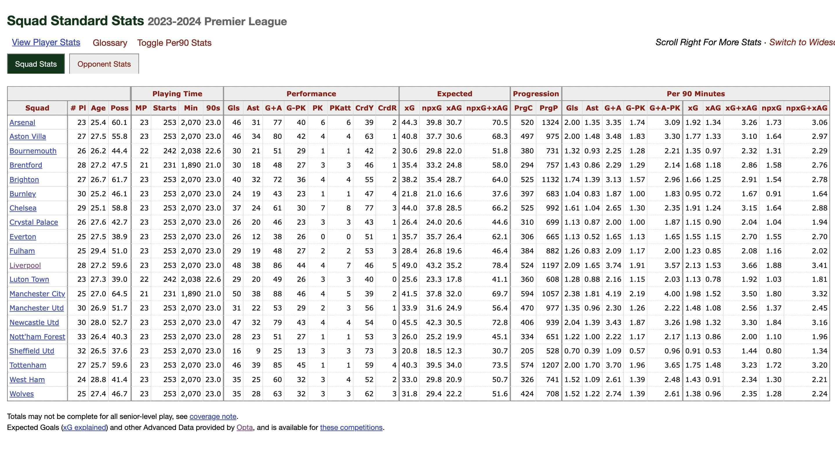
Here we see multiple tables, each describing various parameters for all 20 teams. These include the points table, goalkeeping, shooting, passing stats, and much more. We shall be dealing with the table titled ‘Squad Standard Stats’.
In order to import these tables and carry out any operations, we can use Jupyter Lab. Once you have created a Python3 Notebook inside Jupyter Lab, import the necessary libraries as follows:
import matplotlib.pyplot as plt
import pandas as pd
import numpy as np
import seaborn as sns
Now, we can import the table into a DataFrame (let us call it df) by using the read_html method present in pandas.
url_df =  'https://fbref.com/en/comps/9/stats/Premier-League-Stats#all_stats_standard'
df = pd.read_html(url_df)[0]
df
The DataFrame looks as follows:
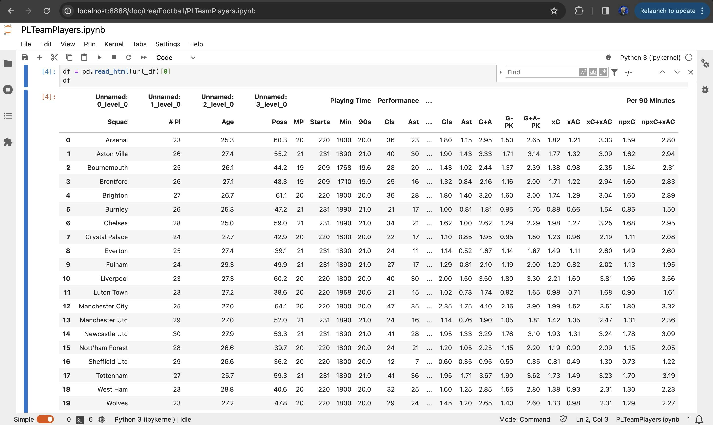
As we can see there is multi-level column naming present by default. This will cause us problems when we try to create visualisations. To fix it, run the following code:
df.columns = [' '.join(col).strip() for col in df.columns]
df = df.reset_index(drop=True)
new_columns = []
for col in df.columns:
  if 'level_0' in col:
      new_col = col.split()[-1]  # takes the last name
  else:
      new_col = col
  new_columns.append(new_col)

# rename columns
df.columns = new_columns
df = df.fillna(0)
Now the DataFrame looks more suitable for manipulation.
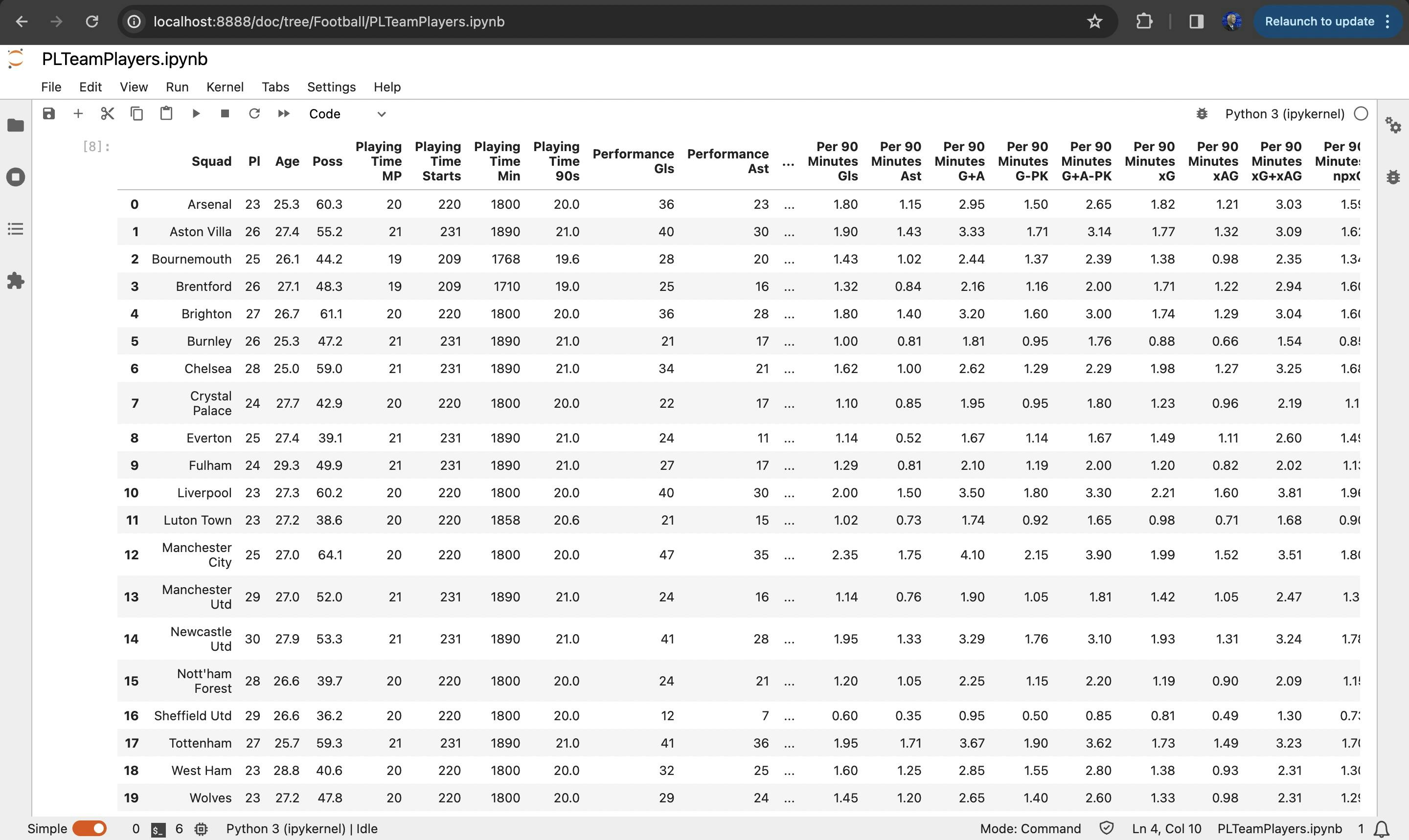
Now, to make things simpler and to easily understand which column name represents which footballing parameter, let us rename some of these names.
df = df.rename(columns={"Poss": "Possession", "MP": "Matches"})
df = df.rename(columns={"Playing Time Starts": "Starts"})
df = df.rename(columns={"Playing Time Min": "Minutes"})
df = df.rename(columns={"Playing Time 90s": "90s"})
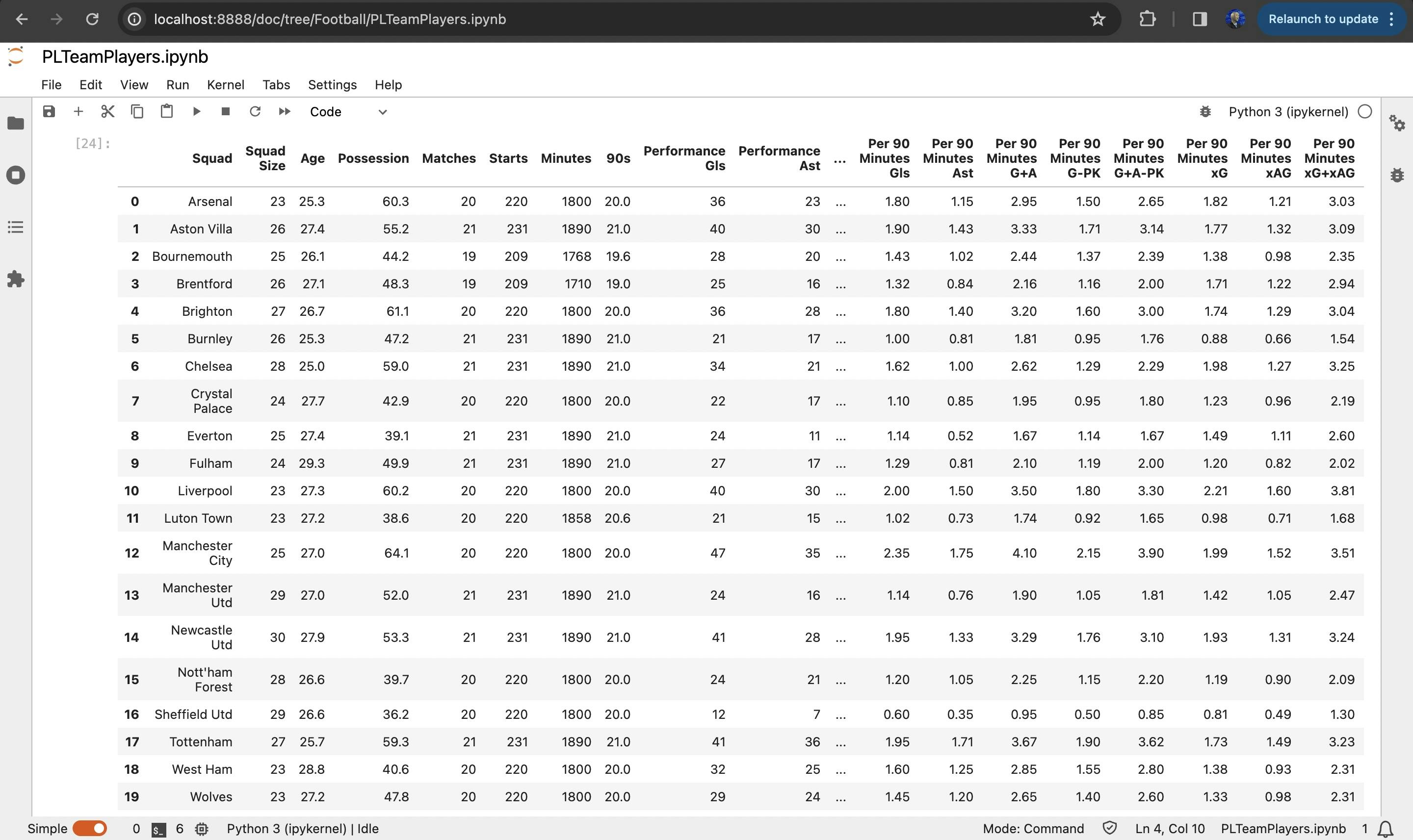
Now, our DataFrame looks a lot easier to understand and we can begin creating visualisations. We shall be using the Matplotlib and Sveaborn libraries for this. Let us start with some simpler plots.
plt.scatter(df['Possession'], df['Expected xG'])

# Adding labels for each point based on the index abbreviations
for i, team_abbr in team_abbreviations.items():
    plt.annotate(team_abbr, (df.loc[i, 'Possession'], df.loc[i, 'Expected xG']))

plt.xlabel('Possession')
plt.ylabel('Expected Goals (Expected xG)')
plt.title('Comparison of Possession vs Expected Goals')
plt.legend()
plt.grid(True)
plt.show()
Possession vs Expected Goals
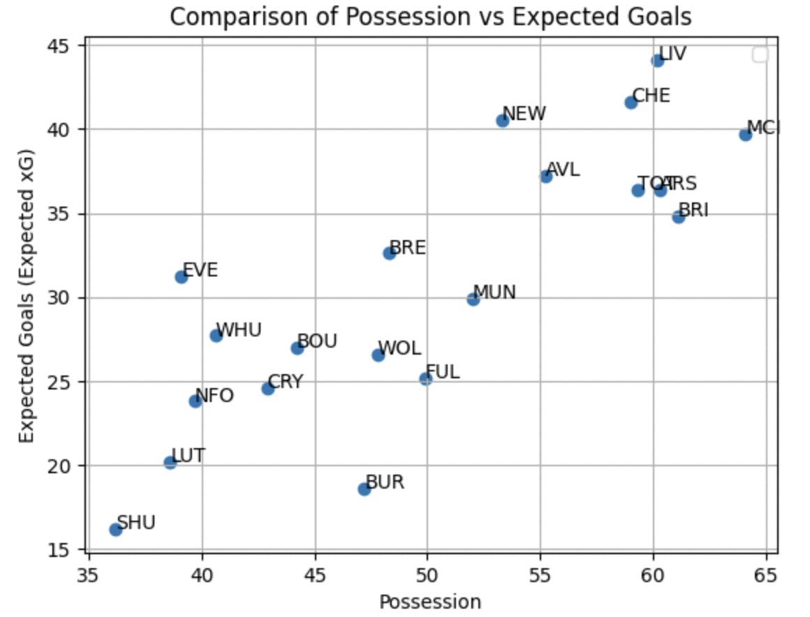
This is a scatter plot depicting the relation between possession percentage and the Expected Goals generated for each team. Expected Goals (xG) is a statistical metric used in football to quantify the likelihood of a scoring opportunity resulting in a goal. It is on a scale from 0 to 1, where 0 means no chance of scoring and 1 means a certain goal. From the scatter plot it is quite understandable that teams which tend to hold more possession of the ball during the match are also likely to have a higher xG tally and dominate proceedings. Everton, though, are a notable outlier in this regard, with an xG count above 30 despite having less than 40% possession.
heatmap_data = df.pivot_table(index='Squad', values='Penalty Kick goals per 90', aggfunc='mean')

# Sort the DataFrame by the values in the 'Penalty Kick goals per 90' column in descending order
heatmap_data_sorted = heatmap_data.sort_values(by='Penalty Kick goals per 90', ascending=False)

plt.figure(figsize=(10, 8))
sns.heatmap(heatmap_data_sorted, annot=True, cmap='viridis', fmt='.2f', linewidths=.5)
plt.title('Heatmap of Penalty Kick Goals per 90 for 20 Teams (Sorted)')
plt.show()
Penalties Scored Per 90
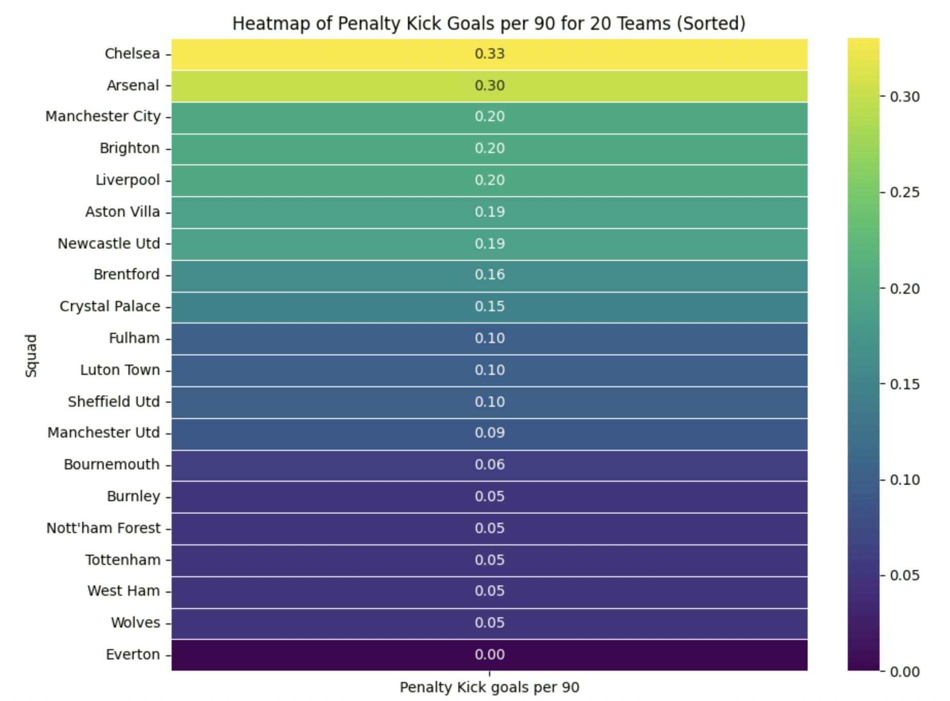
This is a heat-map of how many penalty goals are scored by each team in every match, sorted in descending order. Evidently, Chelsea and Arsenal have the highest penalty count per match, of above 0.3 each. What’s surprising is Everton are rock bottom in this regard. They’ve received ZERO penalties all season! Astonishing. This makes their previously mentioned xG tally even more impressive, given they haven’t been able to rely on spot-kicks for adding to that.
plt.figure(figsize=(12, 8))
plt.barh(index, df['Progression PrgC'], label='Progression PrgC', color='blue')
plt.barh(index, df['Progression PrgP'], left=df['Progression PrgC'], label='Progression PrgP', color='orange', alpha=0.7)
plt.ylabel('Squad')
plt.xlabel('Progression Metrics')
plt.legend()
plt.title('Progression Metrics for Each Squad')
plt.yticks(index, df['Squad'])
plt.show()
Progression Metrics
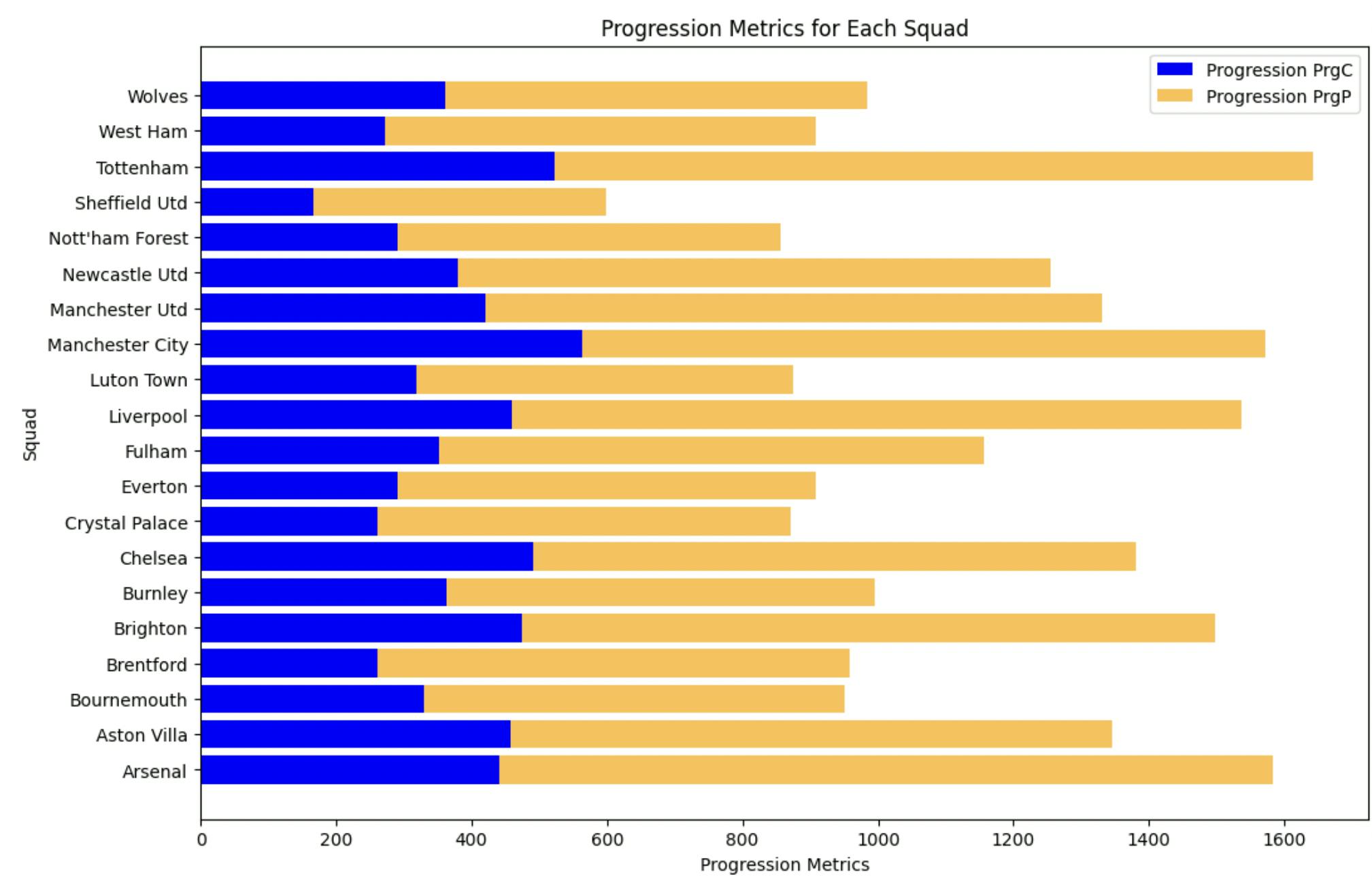
This is a stacked bar-plot of Progression metrics (carries and passes) for each team. Quite remarkably, it’s not Manchester City which tops in this regard, but instead it’s Tottenham Hotspur, who are under a new manager, which makes it even more impressive. Fellow north Londoners Arsenal also pipped City and are second for these progression metrics. Of course it’s important to note that there exist multiple other metrics which determine a team’s progressive nature, such as touches in the final third, penetrative runs, dribbles, etc. so this visualisation is far from conclusive.
Let us dig a little deeper into this dataset and try to find trends or patterns. In order to do so, we shall look at the xG differential (xGD) for each team, which simply refers to the difference between the xG created and xG conceded. A greater value of xGD means a team is creating more chances than it is conceding. Common sense would suggest that the teams with a higher positive value of xGD would tend to fare better throughout the season and see themselves higher on the points table. But does this hold true? Let’s find out.
For this, we need to import the ‘Regular season’ table from fbref and implement the following:
url_df5='https://fbref.com/en/comps/9/Premier-League-Stats'
df5 = pd.read_html(url_df5)[0]
df5

colors = ['lightgreen' if x >= 0 else 'lightcoral' for x in df5['xGD/90']]

plt.figure(figsize=(10, 6))
sns.barplot(x='Squad', y='xGD/90', data=df5, palette=colors)
plt.axhline(0, color='black', linewidth=1)  # Reference line at y=0
plt.title('Difference Between xG Created and xG Conceded Per 90')
plt.xlabel('Team')
plt.ylabel('xGD/90')
plt.xticks(rotation=45, ha='right')  # Rotate x-axis labels for better readability
plt.show()


from matplotlib.table import Table


table_data = []
for i, (index, row) in enumerate(df5.iterrows()):
    table_data.append([row['Squad'], row['xGD/90'], row['Rk']])

table = plt.table(cellText=table_data, colLabels=['Team', 'xGD/90', 'League Position'], cellLoc='center', loc='bottom')
table.auto_set_font_size(False)
table.set_fontsize(10)

# Formatting the table
table.scale(1, 1.5)
plt.axis('off')  # Hide the axes
plt.show()
23/24 Season
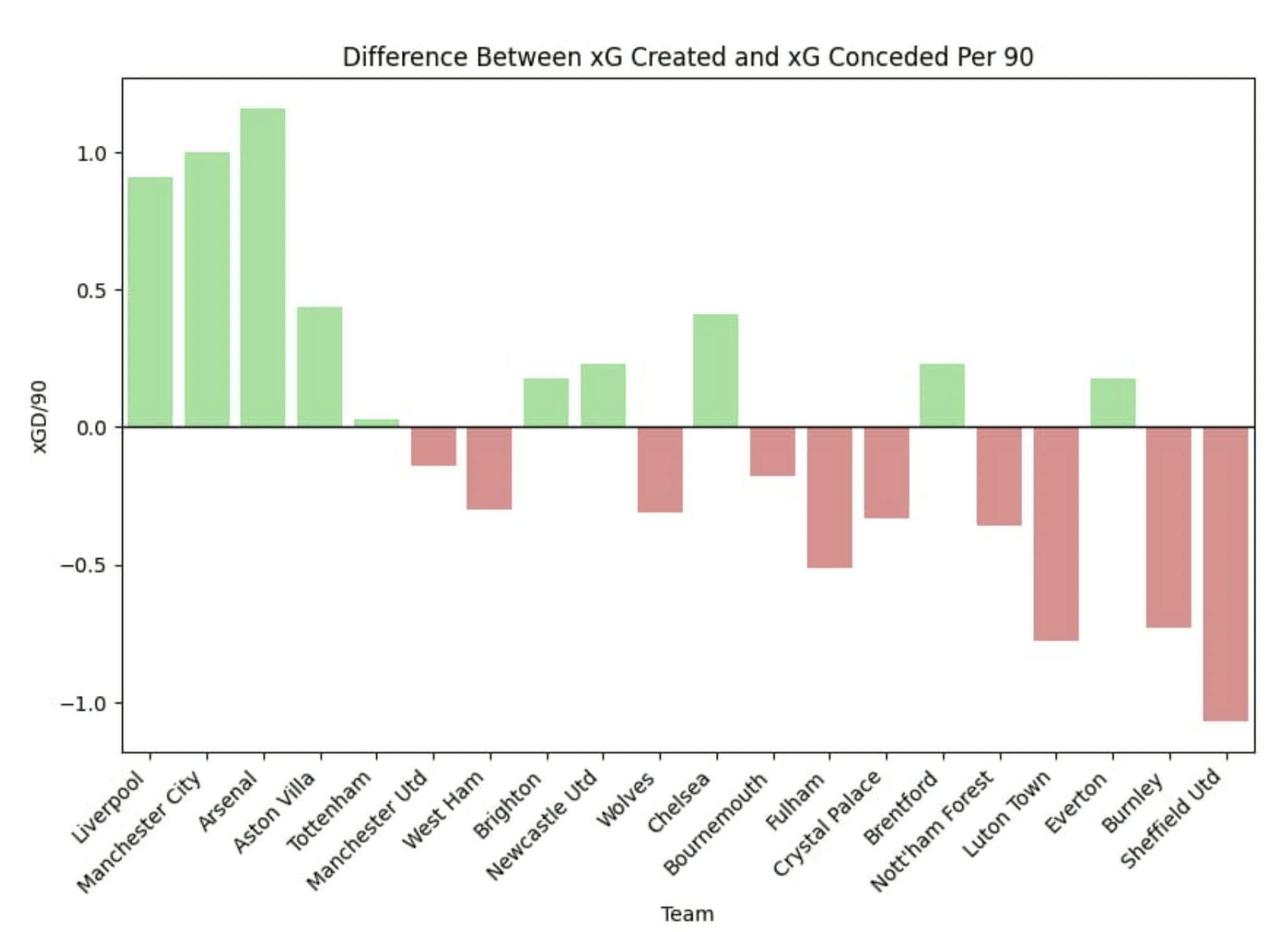
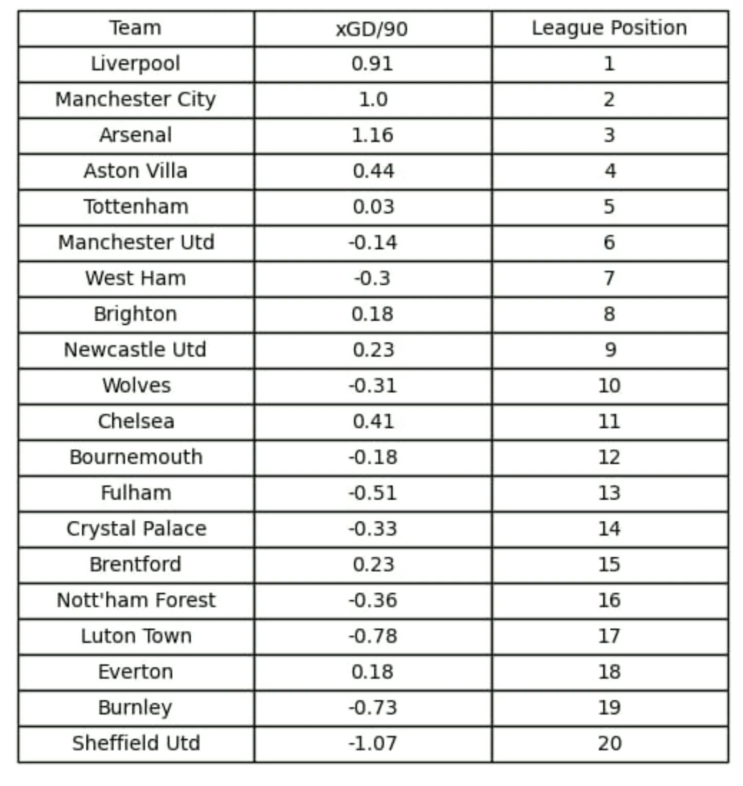
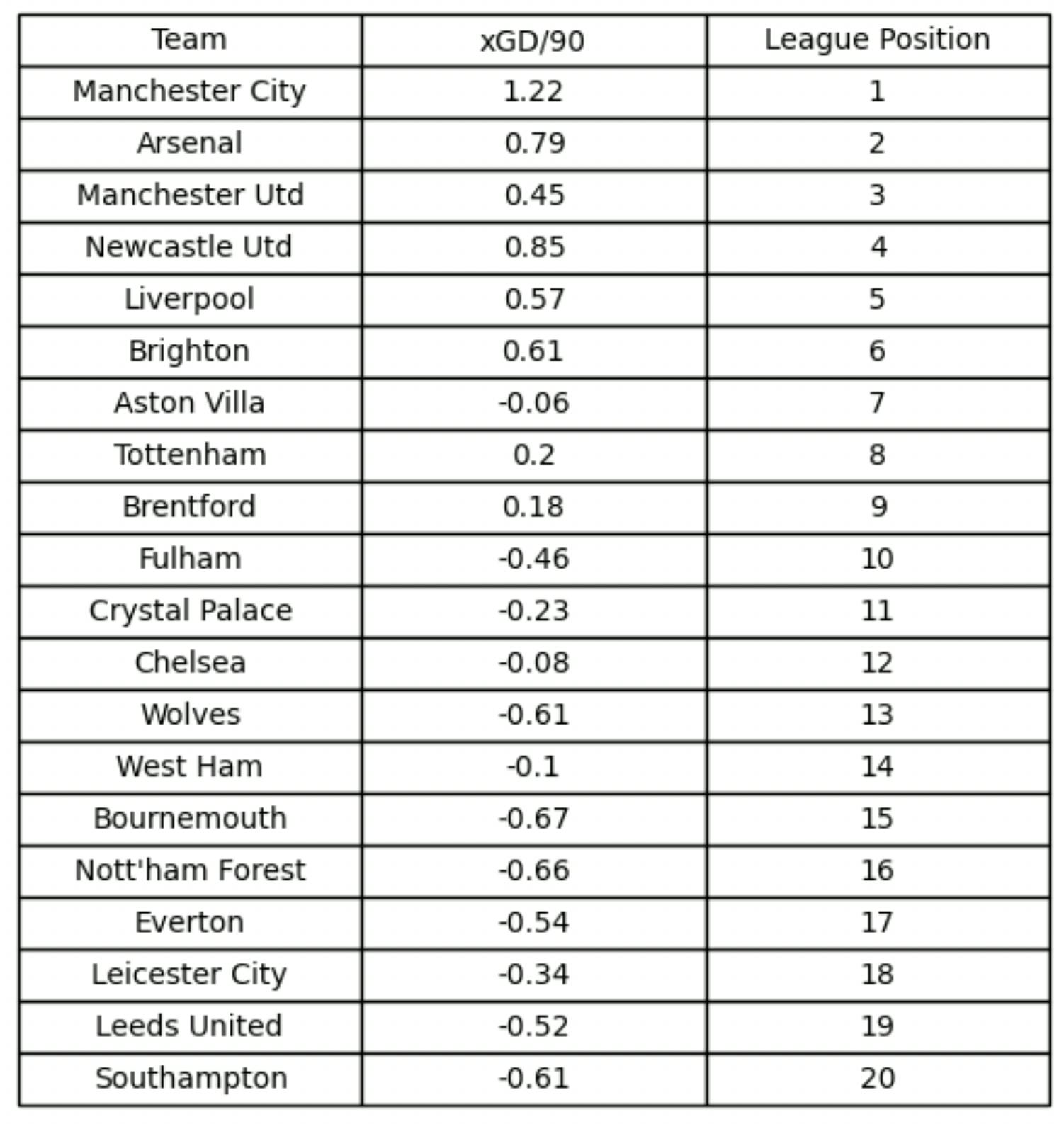
We do, in fact, observe the trend which was previously hypothesised. Teams which create more than they concede tend to fare better. Notable outliers include West Ham who are overperforming and Chelsea who have shown a significant underperformance so far this season. One would expect the law of averages to catch up for both of these teams by the end of the season, in their respective manners.
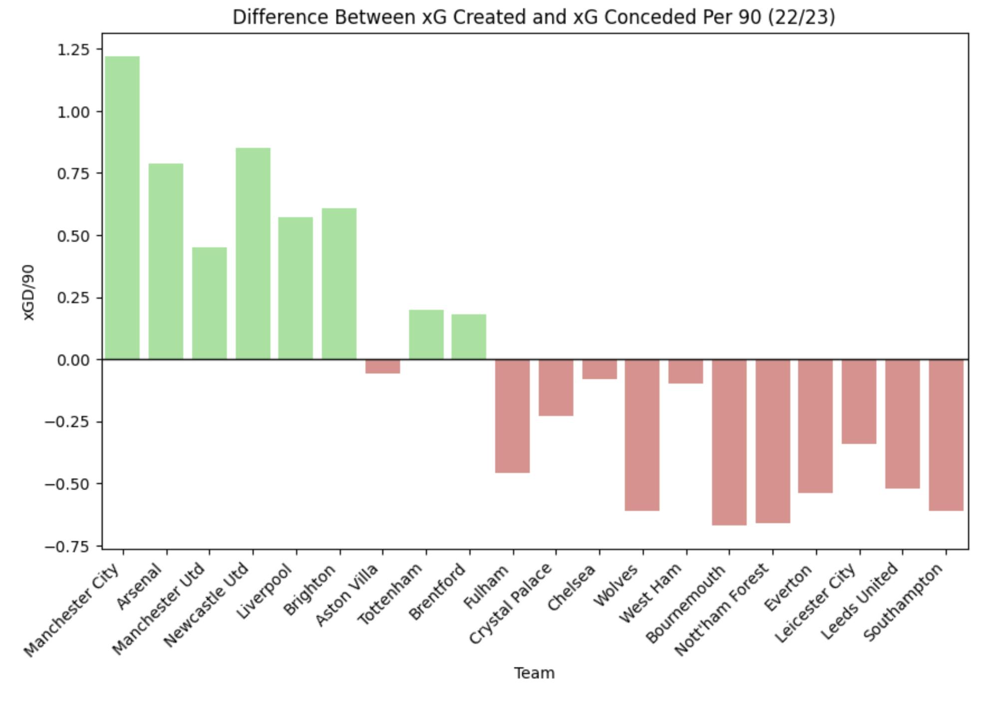
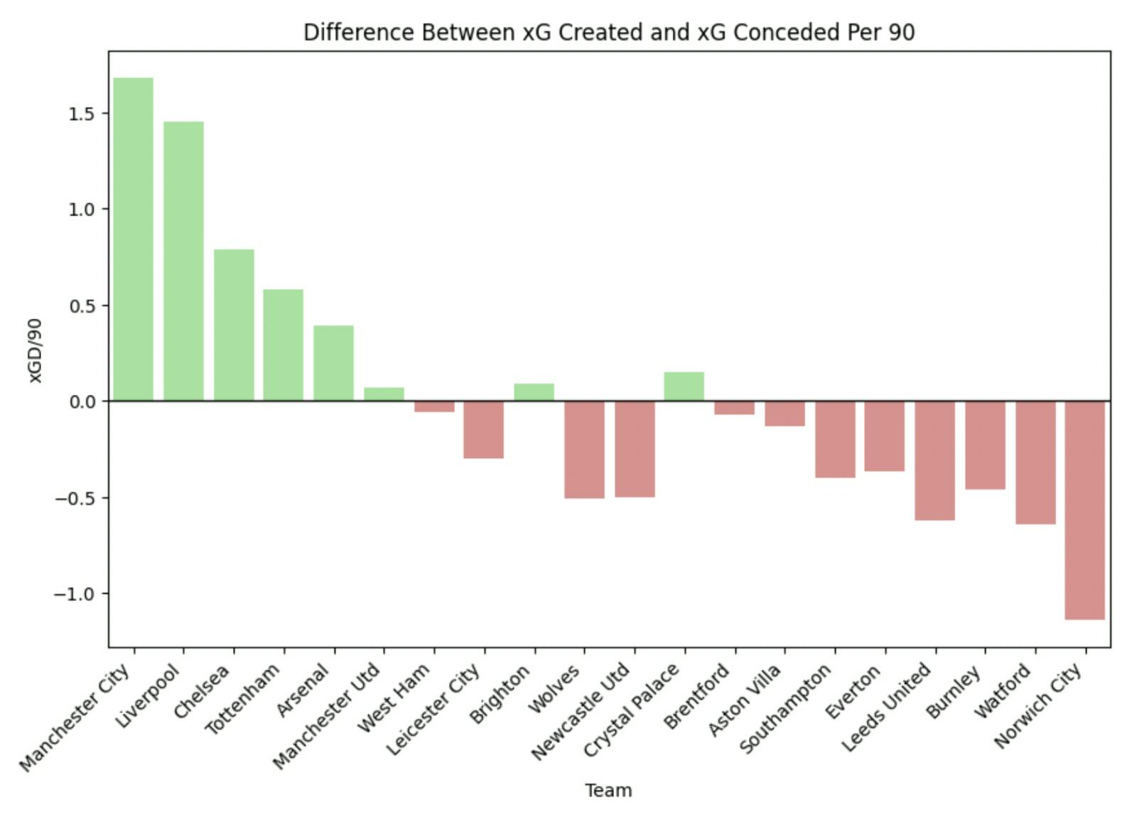
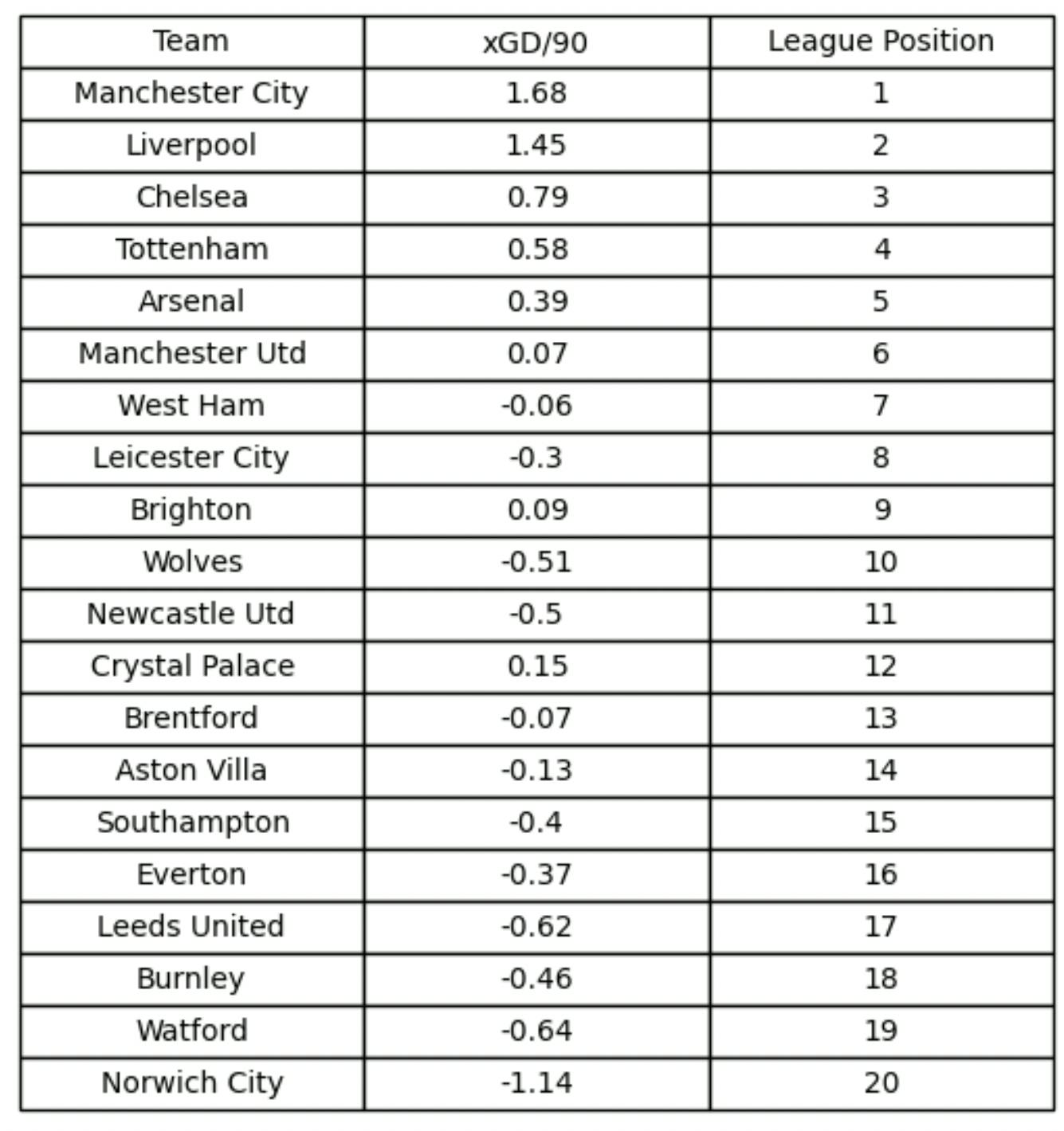
We can try and observe this hypothesis in greater detail and take a look at the xGD from the previous three seasons and try to observe a similar trend. We'll be using the same code snippet as before but for last season’s ‘Regular season’ table from the ‘Previous Season’ section on fbref and observe the following outputs:
22/23 Season
21/22 Season
20/21 Season


Well, that’s quite a handful of barplots. To keep it brief, teams with a higher xGD/90 do tend to fare better and this is observed over the past 3 seasons. In fact, in the 22/23 season, the divide between the 2 halves of the league table is vividly clear from the barplot itself. It’s a bit more of a mixed bag in 21/22, though, with Leicester finishing in the top half despite a noticeably poor xGD/90.
As far as the 20/21 season is concerned, the pattern does hold true once again, but with a notable outlier. Brighton stand out as a dramatic underachiever as they finished 16th despite having a +15.6 xGD throughout the season. This is a higher value than what 5th placed Leicester could amass! Astonishing.
What does all of this information tell us about what could potentially happen this season? Well, basing off past seasons’ trends, one would expect teams like Chelsea, Newcastle and Brentford to move higher than where they currently stand (Everton face a points deduction); and over-performers like West Ham and Man United to fall lower down the table as the season comes to a close. But then again, this is purely conjecture and at the end of the day, it’s 11 players who define the outcome for each team and not a Python program.
Thank you for reading, and I hope you enjoyed this blog! Until next time.
